Fixed the pattern, not just the page
I fixed headings, data tables and focus after page changes, and moved four apps onto the design system’s link components. I also pushed for a page-title fix every page could reuse.
Case study 03
Over three years on VA.gov, I went from flagging accessibility issues in reviews to fixing them in code, and keeping them fixed across four apps.
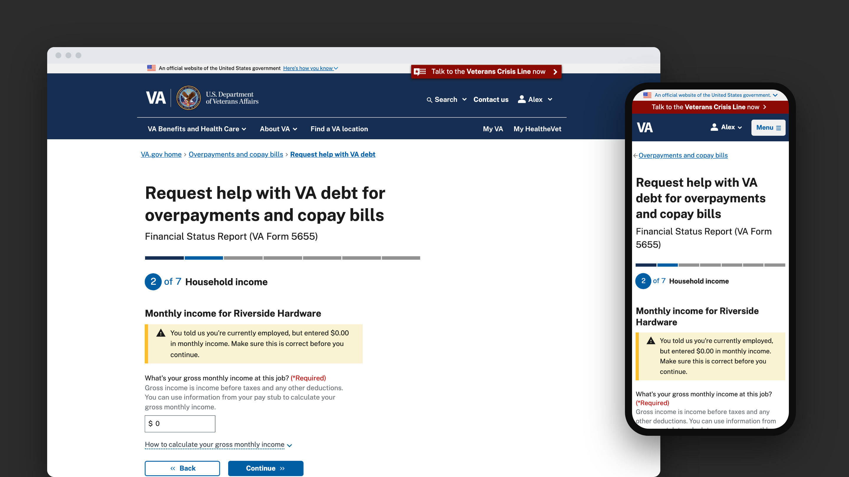
Many accessibility issues showed up late, in formal reviews right before launch, when they’re slowest to fix. Fixing one page at a time didn’t stop them from coming back.
I fixed headings, data tables and focus after page changes, and moved four apps onto the design system’s link components. I also pushed for a page-title fix every page could reuse.
A warning I designed was read twice by VoiceOver. I traced it to two lines of our code, fixed both, and added tests.
I check my own work with VoiceOver, zoom and axe before review, and lock fixes in with automated tests.
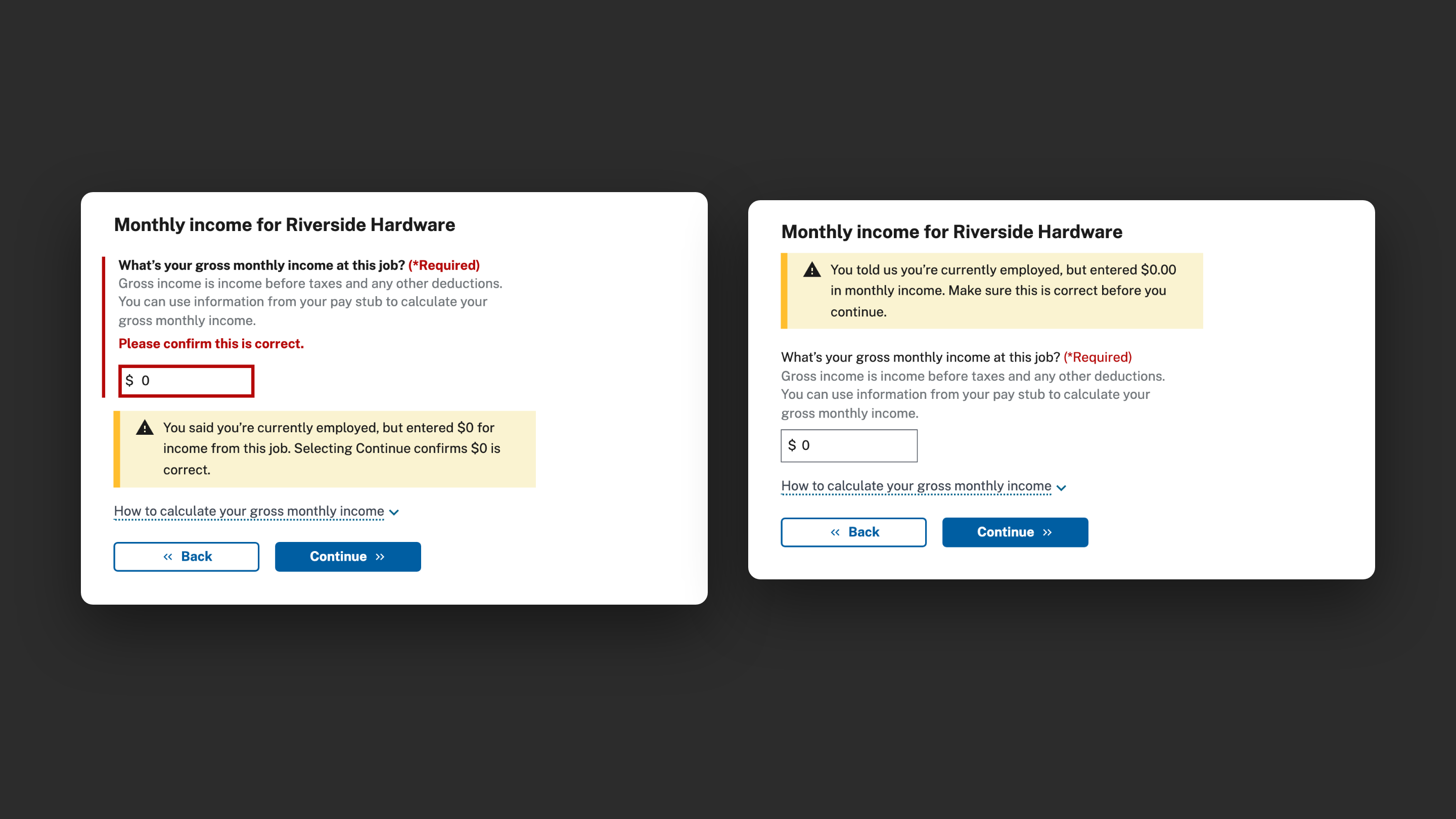
From contrast and zoom in 2023 to root causes in code in 2026.
The VoiceOver fixes shipped in August 2026, and several VA accessibility findings were closed.
Automated tests flag it if a fix ever breaks.
Accessibility is much easier to build in from the start than to add later. I’ve done both.